
CARES
BRAND DEVELOPMENT | LOGO DESIGN | VISUAL IDENTITY GUIDELINES | CUSTOM ICONS | COLLATERAL DESIGN | WEBSITE DESIGN
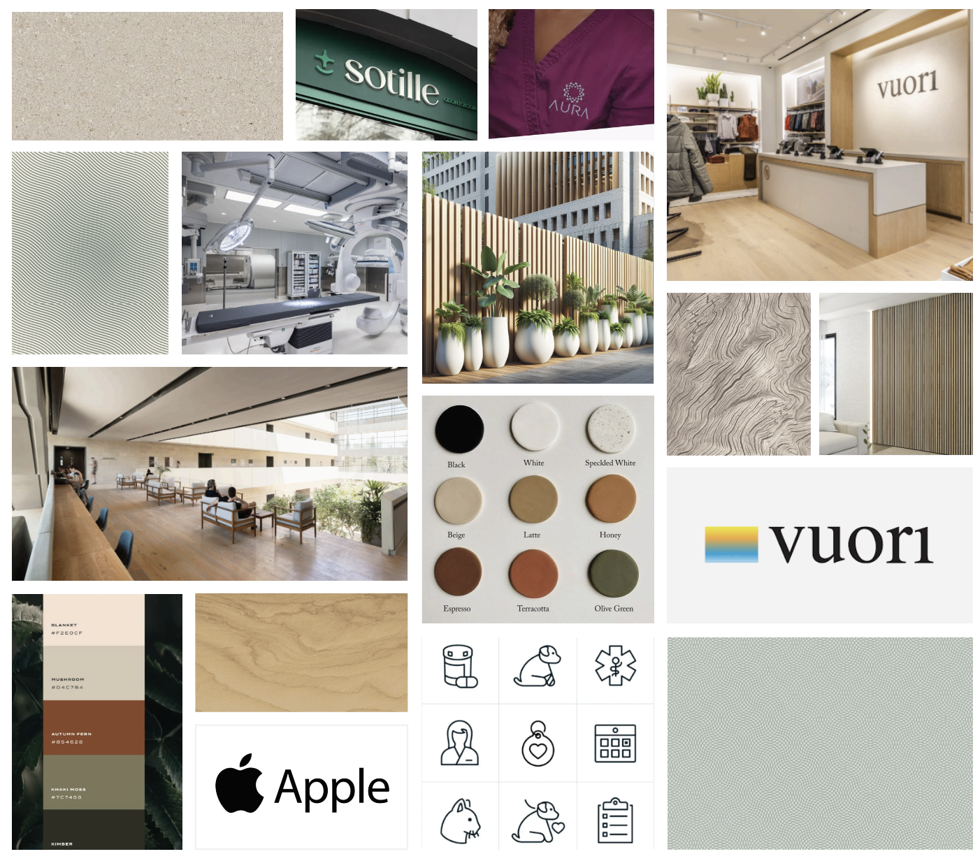
Extraordinary medicine & whole-hearted care. CARES, a premier veterinary hospital in North County San Diego, was in need of a comprehensive brand package, and website that would set them apart and change the way pet owners receive emergency care. The brand was inspired by the world-class, high-tech feel of Apple and the coastal, community feel of Vuori.
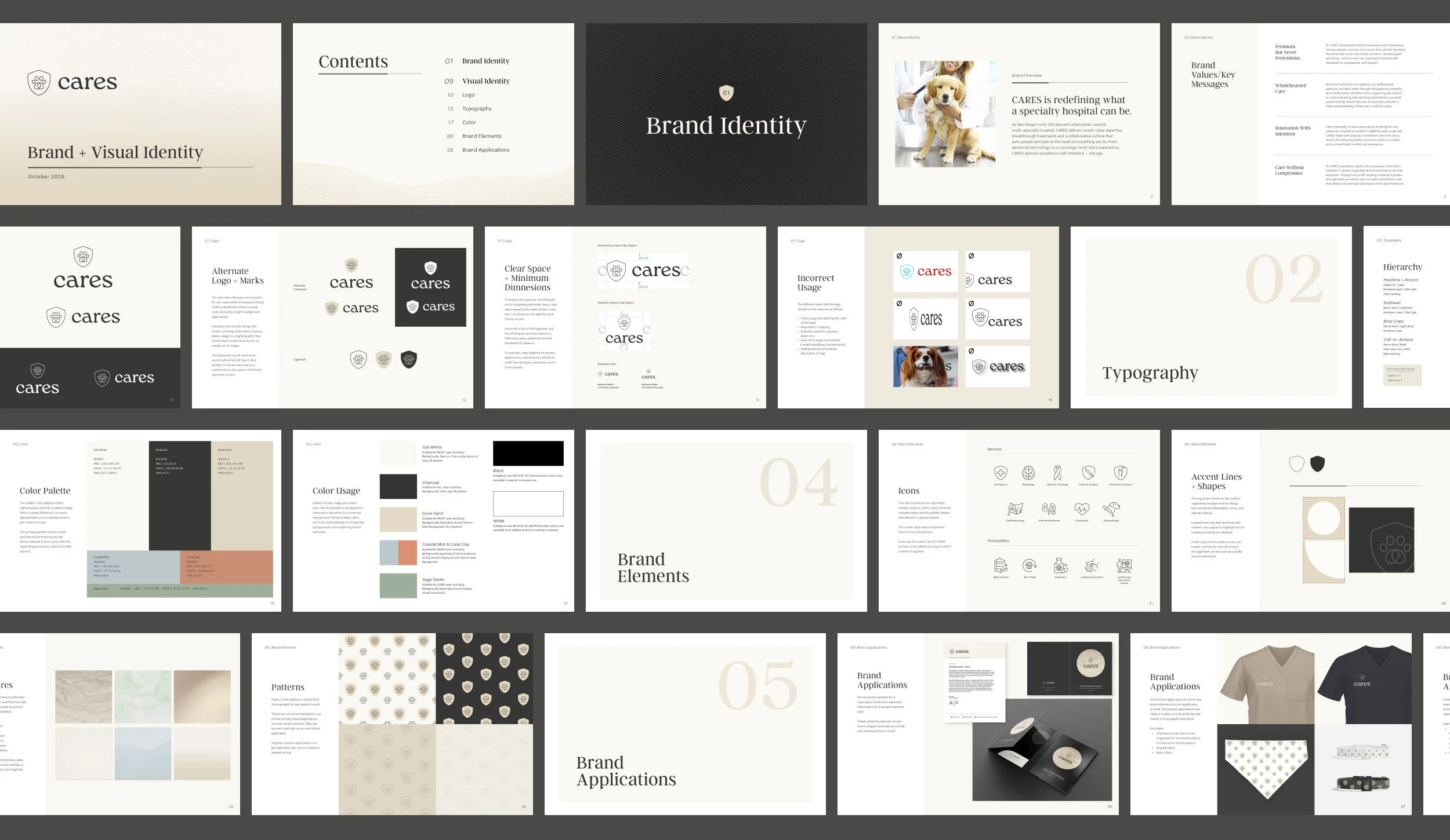
A look into the visuals.
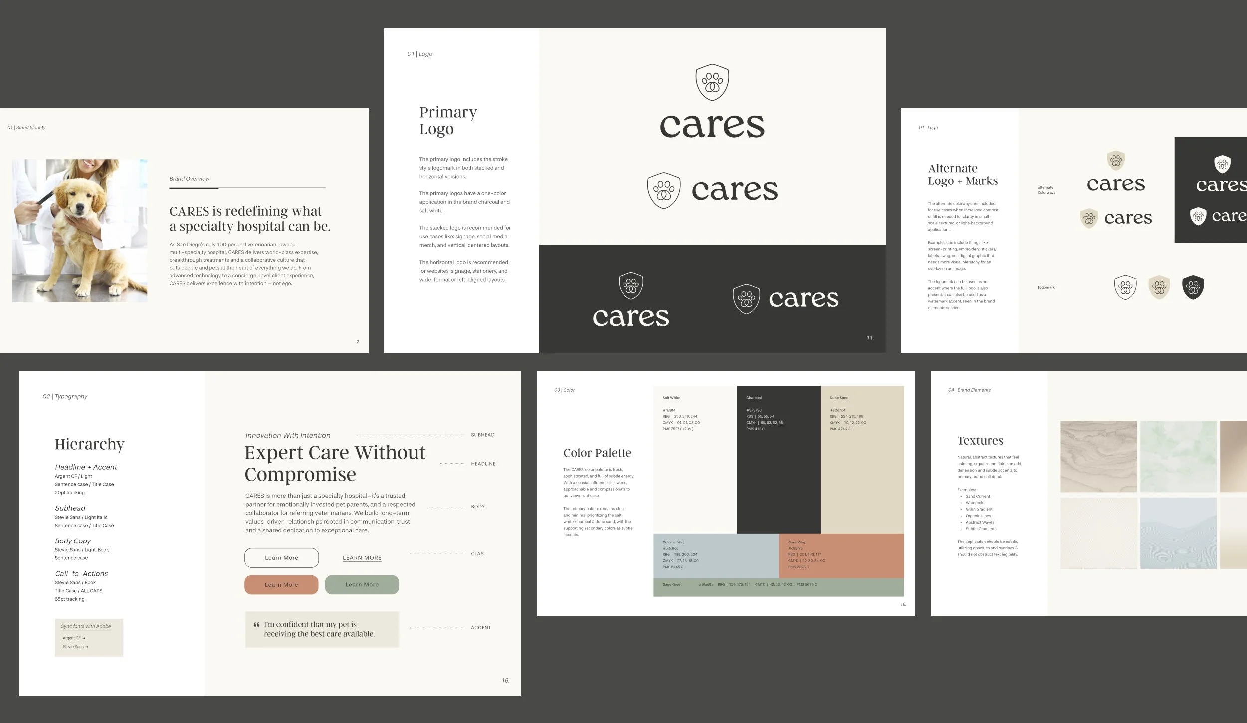
Logo Concept, Typography & Color
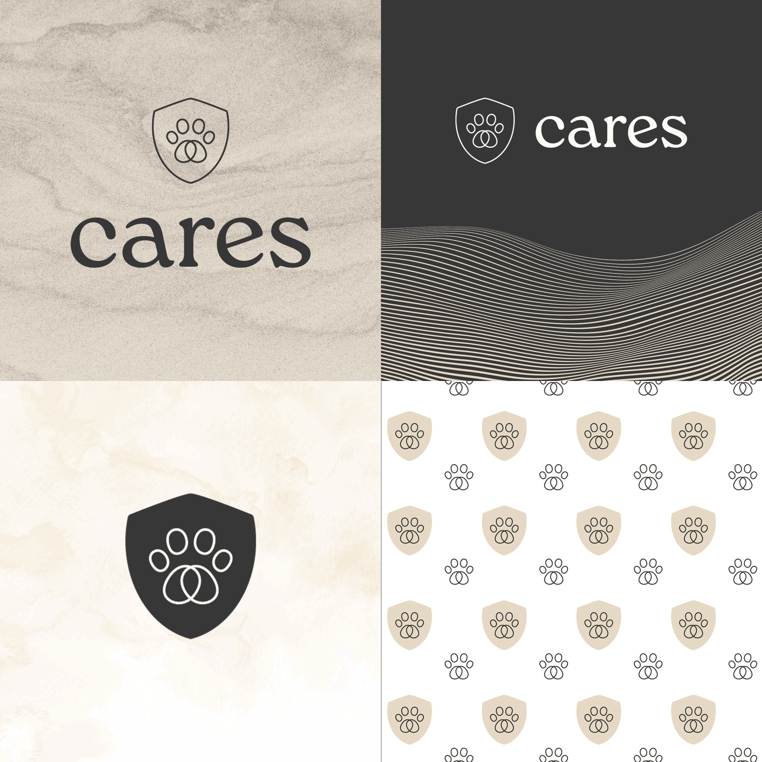
The custom logotype for CARES needed to be approachable and warm in tone while maintaining a professional, & modern aesthetic. A curated paw print with a hidden, upside-down heart is paired with a shield to nod to the medical aspect and reinforce trust & care. The final typography set is lifestyle forward and friendly in tone with a refined application. The color palette leads with a clean, sophisticated primary trio and is balanced by fresh, coastal inspired, warm accents.
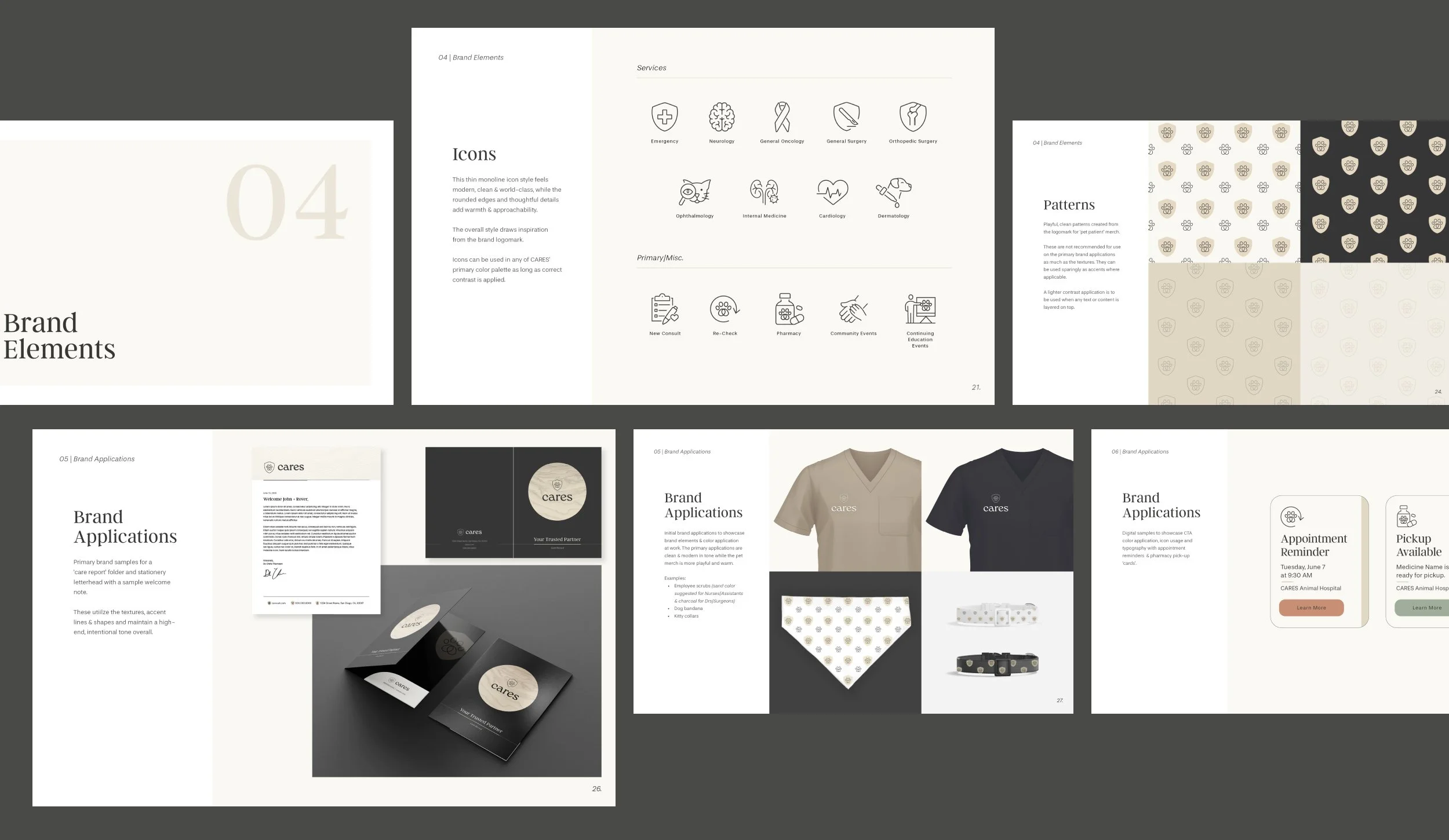
Brand Elements & Applications
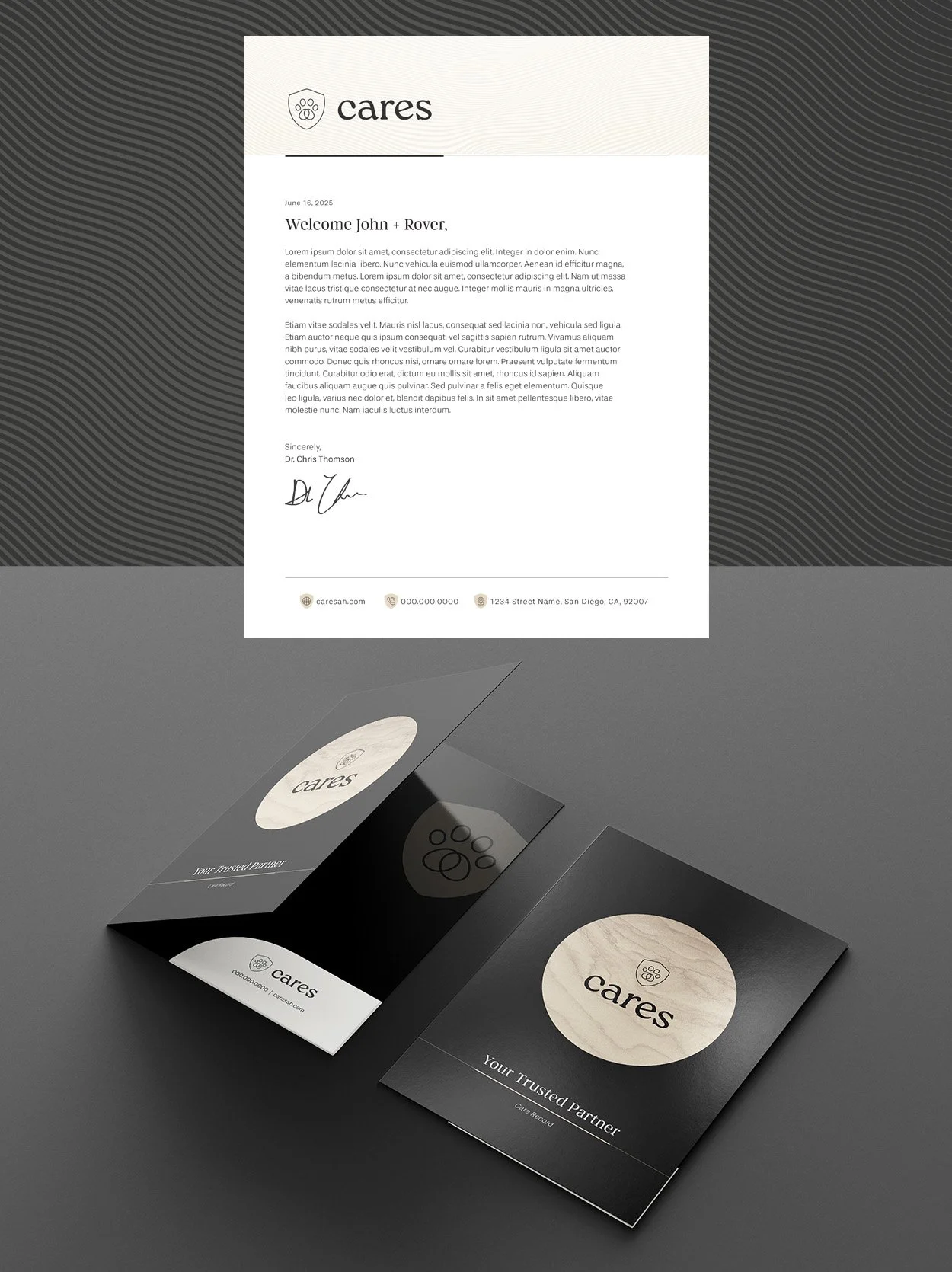
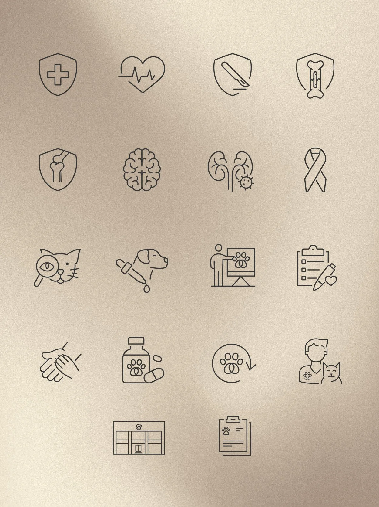
CARES custom icons feel modern, clean and world-class with rounded edges to bring in warmth. The patterns bring in a playful side of the brand to be applied sparingly on ‘pet patient’ merch, while the corporate applications maintain the high-end, intentional tone to align with the rest of the brand.
Art Direction & Design: Lauren Eschborn
Agency & Marketing Director: Mari + Gold, Nicole Bushnell
Client: CARES